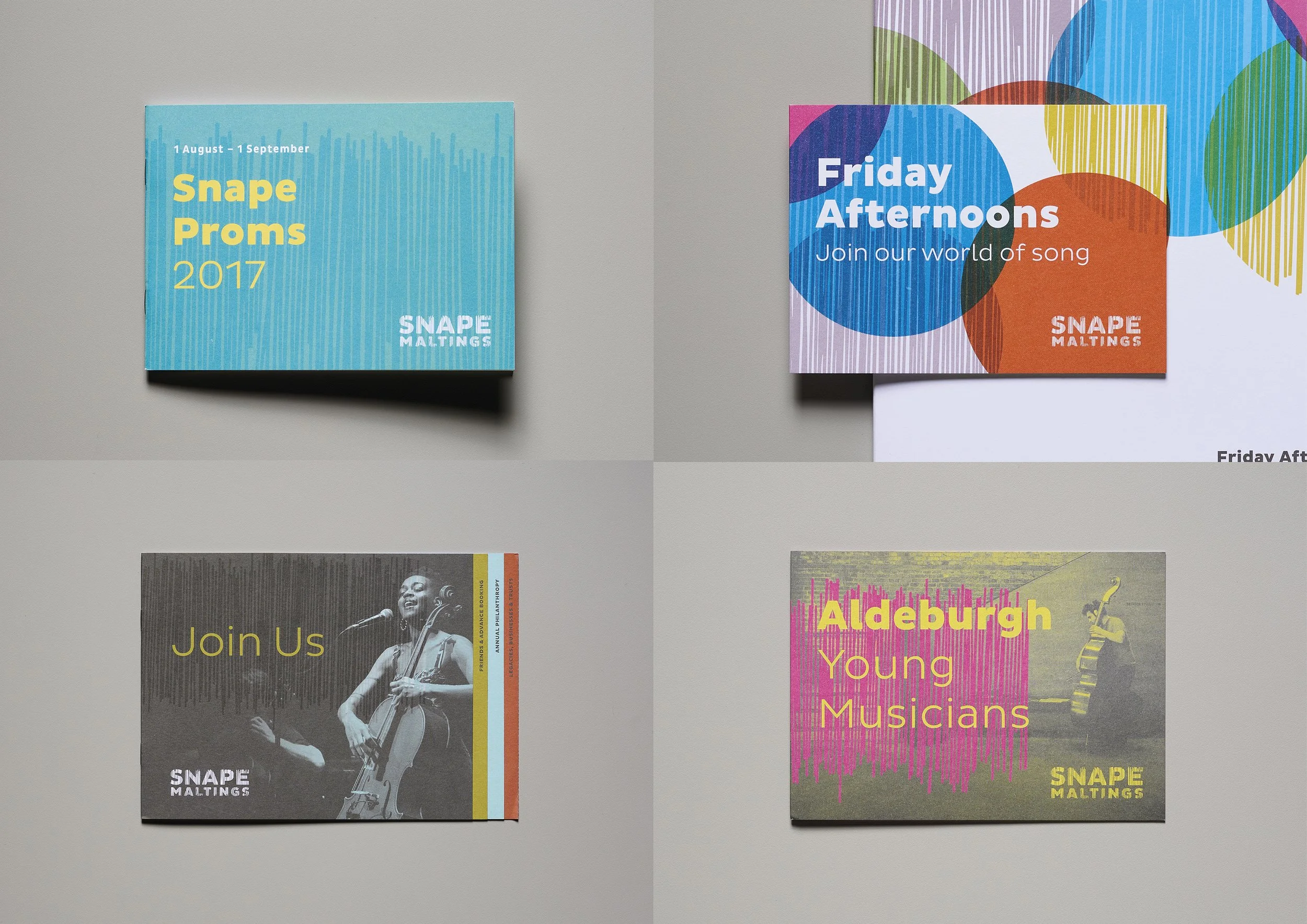
Snape Maltings: reed all about it
When Aldeburgh Music rebranded as ‘Snape Maltings’, unifying the arts and retail operations, I worked with a small team to create the new identity. The concept, inspired by the reeds that envelop the site, is based on a pattern of hand-cut paper strips, and this irregular pattern forms the unique shape of each letter in the logo; also becoming a bespoke font and graphic device.
The core palette of green, red, grey and blue – is reminiscent of the reeds, bricks, slate and sky that make up the surrounding landscape.
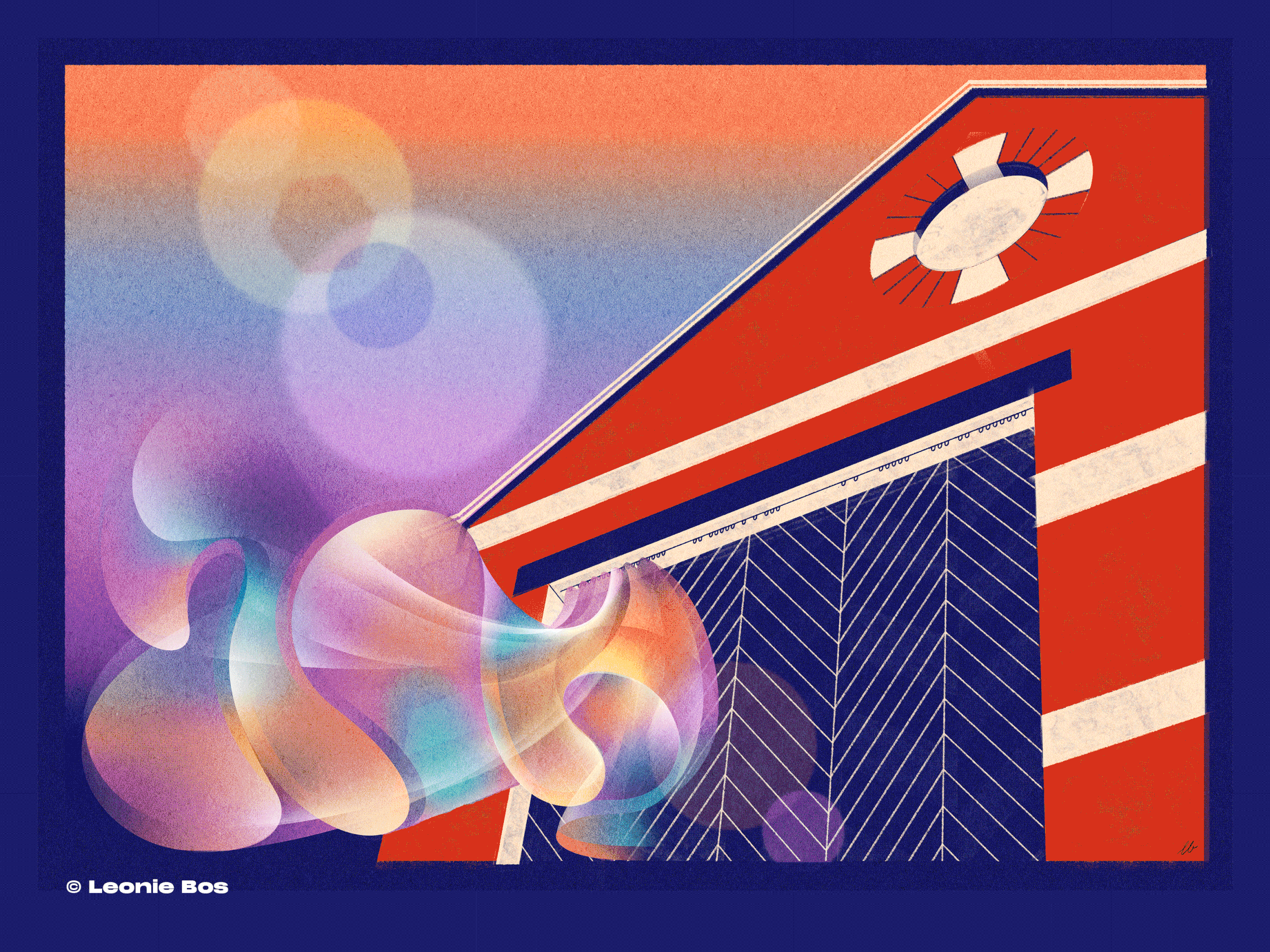
As part of the promotional collateral for concerts, I commissioned and directed an ‘illustrator-in-residence’ to draw the music and landscape. Renowned illustrators such as Brian Grimwood and Leonie Bos have taken up the mantle in recent years.
Art Direction, Concept & Design: Robbie Steer
Illustration: Brian Grimwood (above), Leonie Bos (below)
© Silk Pearce